Room Painting Seattle: The Color Problem Nobody Warns You About
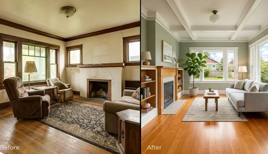
Christine Park called me in March, two weeks after her Capitol Hill living room had been painted by another contractor. "It looked perfect at the store," she said, standing in front of walls that had dried into a cold, flat gray. She'd chosen a color called "Warm Sand" — a color that photographs like a sun-drenched California neutral. In her north-facing Victorian living room under Seattle's March overcast, it looked like the inside of a parking garage.
This is the most common room painting problem in Seattle, and almost nobody talks about it honestly. The city gets 152 sunny days a year — 53 fewer than the national average. The light that falls through Seattle windows is filtered, diffuse, and often blue-shifted. Colors that work everywhere else don't work the same way here. I've been repainting rooms that other contractors got wrong for fifteen years, and the pattern is almost always the same: a color chosen under showroom lighting that transforms into something unrecognizable in Seattle's real conditions.
Seattle gets 152 sunny days/year
vs. national average of 205 — every color choice must account for thisRoom painting from $550
Including Seattle-specific color consultation — no guessing, no repaints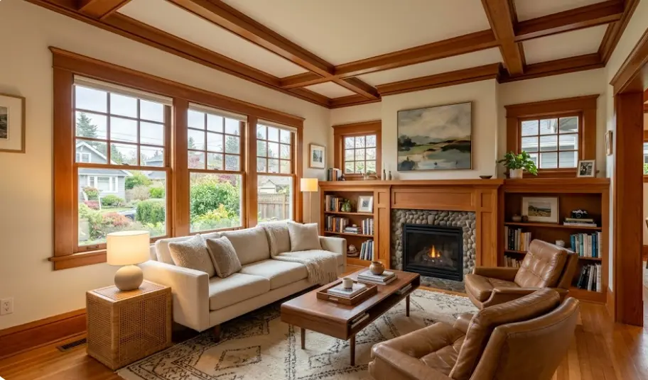
The Seattle Light Problem: What Paint Chips Don't Tell You
Why rooms painted correctly elsewhere look wrong here — and what to do instead
Paint chips are photographed under controlled studio lighting — typically 5500-6500K daylight-balanced light designed to show colors at their best. Seattle's overcast sky produces light in the 6500-7500K range, which is significantly bluer and cooler than the conditions under which most colors are designed to be seen. A beige with warm yellow undertones looks sandy under studio light. Under Seattle's overcast winter sky, those yellow undertones disappear and you're left with whatever cool undertones were hiding underneath — often a greenish or pinkish cast that nobody wanted.
I figured this out the hard way. When I was starting out, I was choosing colors the same way painters do in drier, sunnier markets: pulling fan decks, getting client approval on chips, painting full walls. The complaints started coming in after the paint dried and the rooms felt wrong. Not dramatically wrong — subtly wrong in a way that's hard to articulate but immediately noticeable. "It just doesn't feel the way I expected." I heard that phrase so many times that I started tracking which colors failed and which ones held up.
After about 80 projects, the pattern was clear. Colors with warm undertones that weren't sufficiently dominant got swallowed by Seattle's cool ambient light. Pure grays turned blue or purple. "Neutral" beiges went greenish. Colors that were explicitly warm — ones you might think were almost too warm in a showroom — often ended up looking exactly right in Seattle interiors. The practical implications for room painting are significant, and I now approach every Seattle project with these dynamics explicitly built into the color selection process.
What I Learned After Repainting Christine's Living Room
When I went back to Christine's Capitol Hill living room to fix what the previous painter had done, I tested seven colors under different conditions. Saturday morning overcast, Saturday afternoon partial sun, evening with warm LED overhead light. Only two of the seven looked consistently good across all three conditions.
The one we chose — Benjamin Moore HC-172 Revere Pewter, which I've used in dozens of Seattle rooms since — looks like a warm gray-beige in the morning and a richer, creamier tone in the evening. It adapts to Seattle's variable light rather than fighting it. Christine called me three weeks after the repaint to say her partner had finally stopped commenting on the room, which she described as "the highest possible praise."
Now I bring five or six pre-tested large samples to every initial consultation. I know how they perform in north-facing rooms, south-facing rooms, rooms with minimal windows, open plans with mixed light. This isn't guesswork — it's fifteen years of documentation applied to your specific room.
sunny days per year in Seattle
vs. 205 national average
of Seattle rooms face north or northwest
the most challenging orientation for color
Seattle room painting jobs I assess
were previously painted wrong for local light
Colors That Reliably Work in Seattle Rooms
Warm whites: BM White Dove OC-17, BM Chantilly Lace OC-65, SW Alabaster
Warm neutrals: BM Revere Pewter HC-172, BM Pale Oak OC-20, SW Accessible Beige
Blues that hold: BM Hale Navy HC-154, SW Naval, BM Van Deusen Blue
Greens that work: BM October Mist 1495, BM Aganthus Green, SW Sage
The Specific Trap: "Greige" in Seattle
The gray-beige hybrid that dominated interior design for a decade is particularly treacherous in Seattle. These colors were formulated to look warm and neutral under full sun. Under consistent cloud cover, they shed the "warm" and keep the "gray." I've repainted four Capitol Hill homes in the last two years where the client specifically said they wanted "something not too cool, not too warm" — and what they got from the previous painter looked like industrial paint.
The fix isn't to avoid neutral tones — it's to choose neutrals with significantly more warm bias than you think you need. What looks slightly butter-yellow on the chip looks perfectly neutral on a Seattle wall in January.
When Dark Colors Are the Right Answer
In rooms where natural light is genuinely limited — basement conversions, rooms with small windows on north walls, urban apartments with other buildings close by — I sometimes recommend leaning into the darkness rather than fighting it. A deep Hale Navy dining room in a Beacon Hill bungalow looks intentional and dramatic. The same room painted with a washed-out mid-tone that's trying to be light just looks like a color that failed.
This is a conversation I have with every Seattle client: are we trying to maximize perceived brightness, or are we accepting the room's light conditions and working with them? Both are valid approaches, but they lead to completely different color decisions.
Room by Room: What Works in Seattle
Fifteen years of Seattle-specific observations, room type by room type
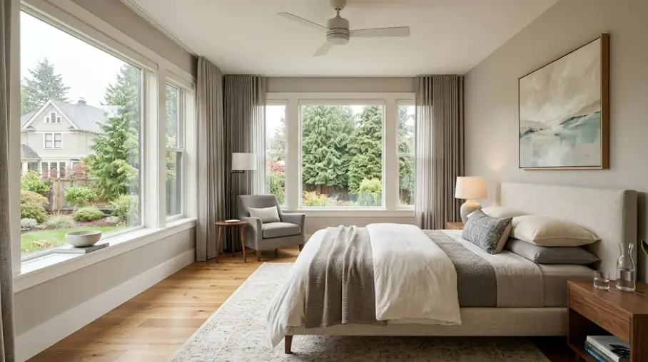
Seattle Bedrooms: The Calm Room Problem
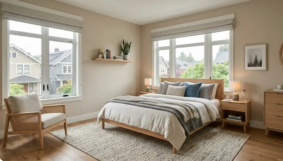
Most people want their bedroom to feel calm and restful. In Seattle, "calm" often gets interpreted as cool and gray — which under November cloud cover turns into something that feels clinical rather than tranquil. The bedrooms I've painted that clients are most consistently happy with use warm undertones even when they look neutral on the chip.
The Tanaka family's master bedroom on Beacon Hill is a good example. They wanted something that felt like a hotel room — sophisticated, not fussy. We started with three options: a cool gray, a warm gray, and Benjamin Moore HC-79 Revere Pewter family color in a lighter value. Under their east-facing windows, the cool gray looked flat and almost lavender by 3pm. The warm option looked like what they'd imagined the cool one would look like.
For Seattle master bedrooms specifically: warm whites read as crisp and clean without going cold. Soft sage greens hold their warmth even under overcast. I tend to steer clients away from lavender-adjacent tones in rooms with morning light issues — they amplify the blue shift in ways that are hard to predict.
Bedroom color picks that hold in Seattle:
- BM White Dove (OC-17) — warm white
- BM Pale Oak (OC-20) — warm greige
- BM October Mist (1495) — soft sage
- SW Accessible Beige — dependable neutral
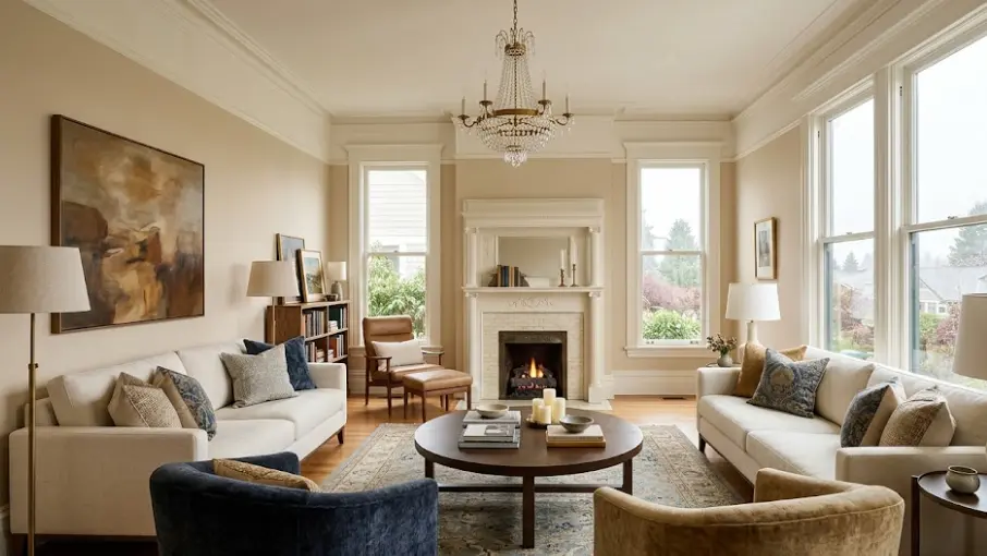
Seattle Living Rooms: The Social Space Challenge
Seattle living rooms are heavily used year-round — when it rains nine months out of twelve, you're inside, entertaining, watching the Olympics, hosting book clubs. The color needs to perform across morning coffee light, afternoon gloom, and evening LED warmth. That three-part lighting audit is how I evaluate every color candidate for a Seattle living room.
The most successful living room I've painted in the last year is a Queen Anne Victorian where the clients had been living with dark green wainscoting and patterned wallpaper for twelve years. They wanted the room to feel larger and lighter without losing the character of the original architecture. We stripped and painted in BM Chantilly Lace on the upper walls with the original molding picked out in a warm white — a two-day project that made the room feel 30% bigger without changing a single piece of furniture.
For open-plan spaces — increasingly common in newer Seattle construction — I approach color differently. When the living room flows into a dining area and kitchen, the colors need to read as a family rather than individuals. I typically use tonal relationships rather than contrasts, especially in rooms where the natural light entering from different directions creates its own contrast through the day.
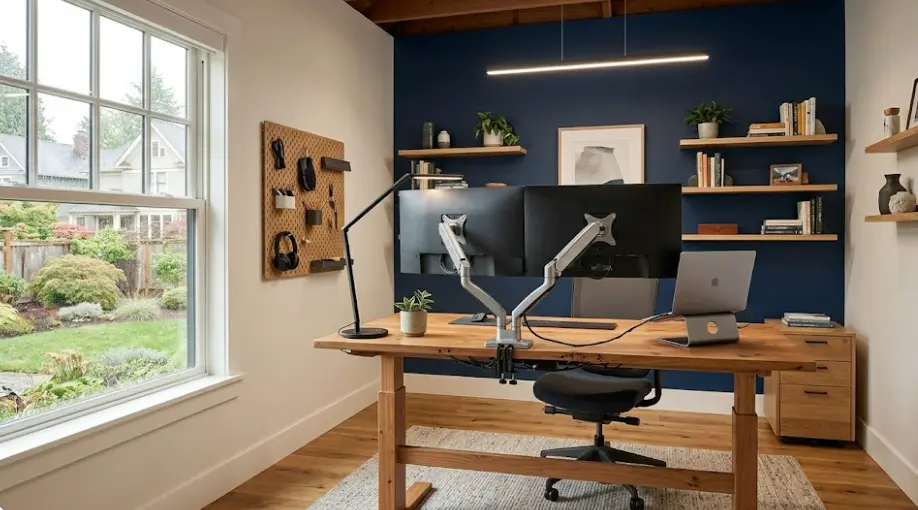
The Seattle Work-From-Home Room
Seattle has one of the highest concentrations of remote tech workers in the country. Amazon, Microsoft, Boeing, Expedia, Zillow — a significant portion of the city's homeowners spend 6-9 hours a day looking at a wall. This is the room type where clients give me the most specific briefs and where I hear the most complaints when something goes wrong.
The Reyes family in Fremont converted their garage into a dedicated home office last year. Marcus Reyes is a senior engineer at Tableau; he works on color-critical data visualizations all day and needed a wall color that wouldn't interfere with his screen work. We tested seven colors over two weeks — he photographed each one at different times of day and ran his actual work interface against each background. The winner was a mid-value warm blue-green that provided enough contrast without introducing the gray cast that cooler tones created on his monitor's bezel.
For video calls — which every Seattle remote worker is doing daily — I've developed a strong preference for warm off-whites and soft warm grays. They photograph well on camera, don't create harsh contrast against skin tones, and don't shift under different lighting the way cooler tones do. I now ask every client with a home office where their desk faces and where their camera points before discussing color.
Seattle Kitchens: Where the Light Is Actually Good
Kitchens are often the exception to Seattle's light problem. Most Seattle kitchens have task lighting installed at reasonable quality levels — under-cabinet LEDs, pendant lights over islands, recessed lighting above prep areas. This means the color performance of kitchen walls is dominated by artificial light more than any other room in the house. That actually makes color selection easier, not harder.
The challenge in Seattle kitchens is usually the other direction: clients who want bright, light kitchens sometimes choose stark whites that look harsh under warm LED pendants. The interaction between a 2700K Edison-style pendant and a blue-white paint creates a visible color cast that most people find uncomfortable but can't quite identify as the light source causing it.
For the Lundqvist family in Ballard — their kitchen has an original 1922 Craftsman built-in with open shelving and a window looking into their garden — we chose BM White Dove for the walls and kept the original fir trim in a warm varnish. The combination reads as historic without being precious. Their LED pendants are 2700K; the paint warm enough to not clash. Their contractor neighbor came over and thought they'd installed new cabinetry. They hadn't touched anything but the walls and ceiling.
Seattle Neighborhood by Neighborhood
Different parts of the city, different architectural realities
Capitol Hill
The densest neighborhood I work in, with the widest architectural range — Victorian mansions on 14th Avenue, 1960s concrete apartment conversions on Broadway, new timber-frame condos mixed with 1910 Craftsman bungalows. Room painting in Capitol Hill is rarely straightforward because each building has its own window situation, ceiling height, and ambient light character.
I've noticed that Capitol Hill renters-turned-owners often want to repaint immediately after buying — they're finally allowed to — and they frequently overestimate how much natural light their rooms actually get. The neighborhood is dense and trees are mature. Many rooms that look bright in summer listing photos are genuinely dim in December. I spend more time on the light conversation in Capitol Hill than anywhere else I work.
Queen Anne
Queen Anne homes tend to be older, larger, and have the architectural details — crown molding, picture rails, built-in cabinetry — that make room painting more complex and more rewarding. A well-executed paint job in a Queen Anne Victorian with properly chosen trim color can make an already beautiful room genuinely spectacular.
The pricing reality in Queen Anne is that rooms take longer. Nine-foot ceilings with plaster, original wood trim that requires careful cutting in, radiators and built-ins that require careful masking — a room that takes four hours in a newer Eastside build might take a full day in a 1905 Queen Anne. I price these projects accordingly and explain the reasons to clients upfront. Cutting corners in these rooms shows in ways that are especially painful given what the architecture deserves.
Ballard
Ballard is where I've done the most Craftsman bungalow work. The homes built between 1910 and 1935 in this neighborhood have specific characteristics: fir floors, Douglas fir trim, sometimes original plaster walls with historic texture, and ceilings that are exactly the right height to make a well-proportioned room look great if the colors are right. Too dark and the rooms feel like caves. Too light and the contrast with the dark fir floor and trim creates a clinical look.
My general approach in Ballard Craftsmans: treat the trim and floor as a given, and choose wall colors that complement the warm orange-brown of old fir. Soft greens work exceptionally well — they reference the surrounding neighborhood without being heavy. Warm grays with yellow undertones pull the fir into the color story rather than clashing with it.
Fremont and Wallingford
These adjacent neighborhoods have similar housing stock — mostly bungalows and foursquares built in the 1920s-1940s — but different client personalities. Fremont tends toward more experimental color choices; clients here are more willing to commit to a bold dining room or a saturated bedroom. Wallingford runs more classic. I've painted Fremont homes in colors I'd never suggest in Madison Park and had them work beautifully.
The Reyes garage conversion I mentioned is in Fremont, and it's representative: clients here are doing non-standard things with their spaces and want painters who can engage with that rather than defaulting to safe recommendations. I find it genuinely interesting work. A home office that's also a recording studio has different acoustic and visual requirements than a standard desk-and-monitor setup, and the color should serve those requirements.
Madison Park and Madrona
The lakefront neighborhoods on Lake Washington's western shore attract some of Seattle's most discerning homeowners. The expectation here is complete — every decision examined, every detail noticed. I've worked on Madison Park homes where the client brought in a color consultant before calling me, and my job was to execute their carefully developed palette flawlessly. I prefer this to being asked to make every decision; precise execution is something I'm confident in.
What makes Madison Park rooms interesting from a painting standpoint is the lake light — south and east-facing rooms get beautiful, bright natural light with an underlying blue from the reflected water. This is almost the opposite of the typical Seattle light problem: these rooms can handle cooler, crisper tones that would look washed out in a Ballard bungalow. I bring different sample sets to Madison Park consultations than I bring to Capitol Hill ones.
Beacon Hill and Columbia City
Two of Seattle's most rapidly changing neighborhoods, and where I've seen the most dramatic room painting transformations relative to investment. Homes bought for $600K-$900K in areas that were ignored ten years ago are being carefully improved by owners who care about getting it right. Many of the homes are structurally sound older buildings with plaster walls and good bones — ideal for painting projects that have real impact.
Beacon Hill sits on a ridge that catches more sun than the Eastlake valley or the urban canyon parts of Capitol Hill. The rooms I've worked on here often get genuine afternoon light — which changes the color calculation significantly. I've been able to use cooler tones here that would have failed in north-facing Capitol Hill rooms with confidence.
Seattle Room Transformations That Worked
Real projects, real outcomes, specific details
The Ballard Craftsman Four-Room Project
Neighborhood: Ballard • Home: 1924 Craftsman bungalow • Investment: $3,800
The Lundqvist family bought their Ballard bungalow with the intention of repainting the entire interior before moving furniture in — the rare project where I get to work in an empty house with good access everywhere. The previous owners had painted everything the same flat white, which had always felt temporary.
We designed a four-color palette: kitchen in BM White Dove, living/dining in BM Pale Oak, master bedroom in BM October Mist sage, and the guest room in a warm oat. The home photographed in their real estate agent's listing materials as a "fully renovated interior" — technically untrue, since only the paint changed. The colors worked with the original fir floors and trim in ways that made the house feel designed rather than refreshed.
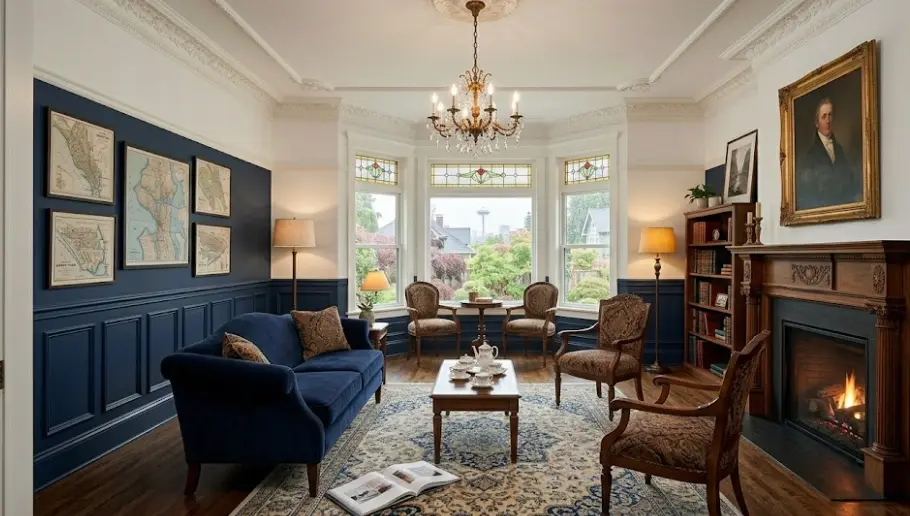
The Queen Anne Pre-Sale Transformation
Neighborhood: Queen Anne • Home: 1908 Victorian • Investment: $4,200
The Okafor family — I've worked with them twice now — were preparing to sell their Queen Anne Victorian after twelve years. Their real estate agent had told them the interior paint was the single thing holding back their listing price. The rooms had been repainted years earlier in colors that had since dated badly: a burgundy dining room, a teal bedroom, a kitchen that had gone from "retro cool" to simply "old."
We neutralized without sanitizing. Chantilly Lace throughout with the original plaster moldings picked out carefully. The dining room got a deep navy on the lower half of the wainscoting that made the room feel like a choice rather than a default. Six days of work. Their agent revised her comparable analysis upward by $65,000 after the photos came back and called it the best pre-listing paint investment she'd seen in three years.
The Capitol Hill North-Facing Rescue
Neighborhood: Capitol Hill • Space: 2BR condo • Investment: $1,900
This is exactly the Christine Park situation I described at the beginning. The client — a software engineer at Amazon — had paid a previous painter to paint her two north-facing bedrooms in "Warm Sand," which had dried into the gray she hated. When she called me, she was six months into living with rooms that felt wrong every morning she woke up in them.
We tested under her actual lighting conditions on a November Saturday — overcast, typical. Four colors went up as test patches. Only BM Pale Oak and BM White Dove read the way she'd hoped her original choice would. She chose Pale Oak in both rooms. The repaint took two days. She emailed me a week later to say her apartment finally felt like home — exactly what she'd wanted six months earlier.
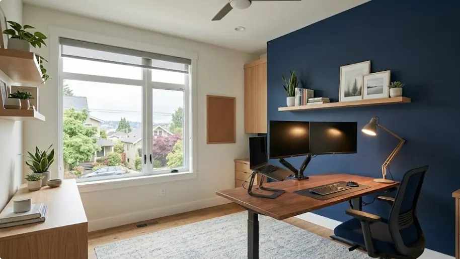
The Fremont Home Office
Neighborhood: Fremont • Space: Converted garage office • Investment: $2,100
Marcus Reyes's garage conversion is the project I reference most when clients ask about home offices. He came to me with a specific problem: the previous office he'd worked in (open plan at Tableau's Seattle office) had walls he found energizing; he wanted his home office to feel similar without making it feel like work was following him home.
The solution was a feature wall in BM Hale Navy behind his monitor — strong enough to feel intentional, warm enough to not feel cold — and warm white on the three remaining walls. The contrast is significant but not jarring because the navy is warm-undertoned rather than pure blue. Three colleagues have visited his home office for in-person collaboration sessions and asked who designed it. He gives them my number.
How a Seattle Room Painting Project Actually Works
No showroom samples. No guessing. Here's the real sequence.
In-Home Light Assessment
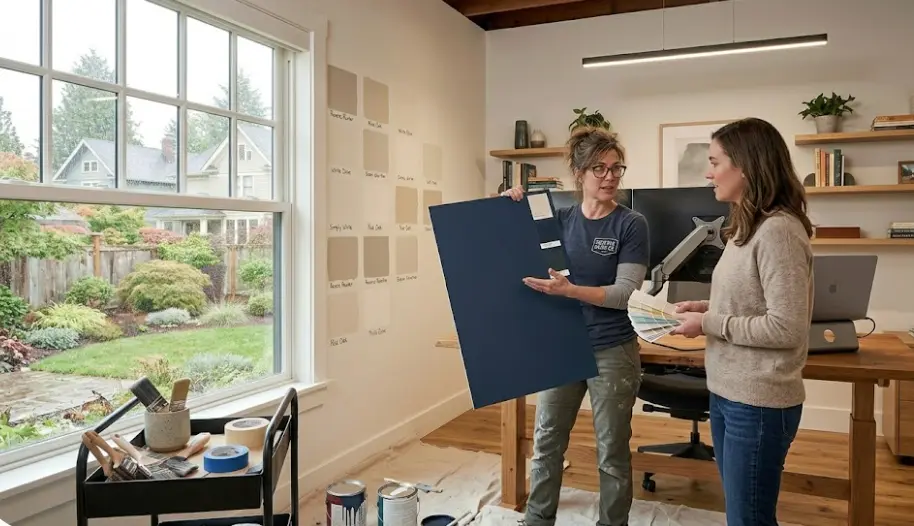
I come to your home at a representative time of day — ideally a cloudy day, since that's Seattle's baseline — and we look at the room together before I even mention color. Which direction do the windows face? What kind of artificial lighting is installed and what's its color temperature? Is there a fireplace or a TV that creates warmth in evenings? All of this shapes the color possibilities before we've looked at a single chip.
I bring a selection of large pre-tested samples — colors I've documented performing well in similar Seattle conditions. We put them on walls and look immediately, without any staged showroom lighting. This is how you avoid the problem most Seattle homeowners encounter when they pick a color at a paint store: your walls are the test, not the chip.
Scope and Surface Assessment
Once color direction is established, I assess the surfaces. Seattle homes — especially in neighborhoods like Ballard, Queen Anne, and Capitol Hill — often have plaster walls with decades of paint layers on them. Plaster can have hairline cracks that need attention before painting, or failing paint from a previous project that needs to be addressed rather than painted over. I document surface conditions and include necessary prep in the scope.
For rooms that have been smoked in, have water stain history, or previous dark colors, I'll specify a shellac-based primer as part of the process. Skipping this step to save a day costs homeowners months of watching bleed-through reappear through fresh paint. I've seen it enough times that I won't leave it out of a scope where it's indicated.
What goes into the surface assessment:
- Paint condition and adhesion check
- Crack and hole documentation
- Stain or odor history
- Previous color (affects blocking needs)
- Trim condition and finish type
Preparation: The Hidden Work
Professional room painting preparation takes longer than most homeowners expect and is responsible for most of the quality difference between professional and amateur results. Furniture is moved or covered with canvas drop cloths (not cheap plastic that shifts and tears). Floors are protected with professional-grade covering. Outlet covers come off. Switch plates come off. Trim is taped with precision — I use Frog Tape for all my room work because the bleed performance on textured Seattle plaster walls is significantly better than standard painter's tape.
Holes get filled, dried, sanded, and feathered so they're invisible at arm's length. Larger damage — the kind from anchors, doorknob impacts, or the small drilled holes people leave everywhere — gets compound work that may require light sanding of the surrounding area. Doing this correctly takes time. Doing it incorrectly means you can see the patches through the finished paint every time the light hits the wall at a shallow angle.
Application and Final Walkthrough
I apply two coats minimum on walls — sometimes three if we're going significantly lighter than the previous color. For Seattle rooms with high humidity exposure (bathrooms, kitchens with poor ventilation), I use products with appropriate moisture resistance. Trim gets its own application sequence, typically separate from wall work, because the two surfaces require different techniques and cutting-in between them is the most visible detail in any room.
Final walkthrough happens under the room's actual lighting before I pack equipment. I look at every wall under raking light — a portable LED work light at a low angle will show every imperfection that flat ambient light hides. Touch-ups happen on-site before I leave. I don't charge separately for touch-ups that are part of achieving the originally specified result; they're part of the job.
Room Painting Pricing in Seattle
Transparent pricing that reflects what professional work actually costs in this market
Single Room
- ✓ Bedroom, office, or bathroom
- ✓ In-home light assessment
- ✓ Full surface preparation
- ✓ Premium BM or SW paint
- ✓ Two coats walls + trim
- ✓ Complete cleanup
- ✓ 2-year warranty
Living or Dining Room
- ✓ Larger room with more trim detail
- ✓ Extended color consultation
- ✓ Accent wall option included
- ✓ Ceiling painting available
- ✓ Crown molding cutting-in
- ✓ Full surface preparation
- ✓ 2-year warranty
Multi-Room Package
- ✓ 3–5 rooms coordinated palette
- ✓ Full home color strategy
- ✓ All rooms prepared and painted
- ✓ Consistent trim treatment
- ✓ Pre-listing option available
- ✓ Priority scheduling
- ✓ Extended warranty
Factors That Affect Seattle Room Painting Pricing
Ceiling height matters significantly — rooms with 9-foot or higher ceilings require more material and time than standard 8-foot. Older plaster walls in Capitol Hill, Queen Anne, and Ballard homes typically require more prep than drywall. Dramatic color changes (dark to light or light to dark) may require a primer coat that adds time. I provide written scopes that itemize these variables so there are no surprises.
All pricing includes premium paint — I use Benjamin Moore or Sherwin-Williams on every project. Consumer-grade paint from big-box stores costs less upfront and significantly more within two years when it's failing.
What Seattle Homeowners Say
Accounts from clients across the city's neighborhoods
"I'd already paid another painter to repaint my living room and hated the result. Antonio came out on a rainy Tuesday — the exact light conditions I live with most of the year — and tested colors on my actual walls. The difference in process was immediately apparent. The color he recommended looked nothing like what I'd expected from the chip and was exactly right in the room. I don't understand how the first painter didn't know this."
— Christine Park
Capitol Hill • Living room repaint, $1,100"We were selling our Queen Anne Victorian after twelve years and needed everything repainted before listing. Antonio designed a palette that made the original 1908 architecture feel intentional rather than dated. Our agent revised the listing price upward by $65,000 after the photos came back. Six days of work, $4,200 investment. The math is overwhelming."
— James & Keiko Okafor
Queen Anne • Pre-sale 9-room repaint, $4,200"My home office is where I spend 8 hours a day on Zoom calls with engineers in three time zones. The wall behind me needed to look professional and not distract. Antonio asked questions about my monitor position, my camera angle, and the color temperature of my lights before suggesting anything. Nobody had ever approached it that way. The result photographs perfectly and three colleagues have asked me who designed my setup."
— Marcus Reyes
Fremont • Home office conversion, $2,100"We bought our Ballard Craftsman knowing we'd repaint everything immediately. Antonio coordinated four colors across the whole house that feel related without being monotonous. The original fir floors and trim are central to the house's character — the colors he chose work with them rather than fighting them. I've had multiple people ask if we renovated the entire interior. We painted it."
— Erik & Sofia Lundqvist
Ballard • Four-room Craftsman palette, $3,800"I'm an architect. I thought I understood color well enough to specify my own rooms. I was wrong about how Seattle's light would interact with my choices. Antonio's in-home testing process caught the error before anything went on the wall permanently. What I thought was a sophisticated neutral turned lavender under my north-facing windows in November. What he suggested instead looked exactly like what I'd originally envisioned."
— Priya Nair, AIA
Madison Park • Master bedroom + study, $1,650"We rent in Capitol Hill and were allowed to paint our apartment when we signed. Antonio handled the landlord communication about the process, did the work without requiring us to move out, and the result genuinely changed how we feel about coming home. He also told us which colors were most likely to be approved without issue when we leave — thinking about the whole picture, not just the immediate job."
— Jordan & Alex Kim
Capitol Hill • 2BR apartment, $1,800What You Can Count On
The commitments behind every Seattle room painting project
Color Guarantee
If the color we select together doesn't perform the way we agreed it would in your room's actual conditions, I repaint at my cost. Not a theoretical guarantee — I've honored it.
2-Year Finish Warranty
Complete warranty against peeling, bubbling, or adhesion failure. Professional-grade materials and proper prep mean I rarely need to invoke this, but it's there.
Timeline Guarantee
Project finishes on the date I commit to or you receive a credit. Professional project management — you'll know what's happening and when throughout.
Complete Cleanup
Every drop cloth, every piece of tape, every paint can leaves with me. Your room should be usable the same day we finish, not the day after cleanup.
Complete Seattle Painting Services
Room painting alongside everything else your Seattle home might need
Interior Painting
Comprehensive interior painting in Seattle for whole-home transformations and repaints.
Exterior Painting
Professional exterior painting in Seattle with products engineered for Pacific Northwest weather.
Wall Painting
Specialized wall painting services in Seattle for accent walls and feature treatments.
Get the Color Right the First Time
In fifteen years of painting Seattle rooms, I've learned that the most expensive room painting project isn't the one done well — it's the one done wrong and then redone. The color consultation is not an add-on; it's how I prevent the problem that brings most clients to me in the first place.
Tested in Your Actual Light
Not showroom samples — your walls, your conditionsSeattle-Specific Experience
15 years, 420+ Seattle projects, every neighborhoodCall or message today. I'll come out, look at your room, and tell you honestly what I think the right approach is — including color, prep requirements, and realistic timeline and cost.
Or call directly: